X-Nikon
Branding design, Corporate Identity
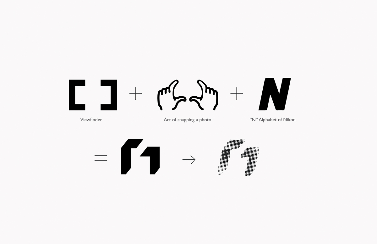
X-Nikon is the corporate identity for Nikon's upcoming new factory outlet. This store has a concept in which they only do dealings of refurbished Nikon cameras and old modelled DSLR camera bodies only. Following the nature of the business it's name was born,"X-Nikon", the "X" actually comes from the meaning ex.
The logo symbol carries an organic look more making the new factory outlet concept a friendlier one with a casual tonality. Also at the same time to convey the brand voice, the logo brings forth it's values of quality, sophistication and trust in products manufactured through the choice colors of gold and black. Gold signifies value and elegance, Black is used also as an representation for quality and protection, conveying a sense of trust and stability. The custom typeface of Nikon was the brand equity that I decided to bring forth, to enhance the brand essence in the new logo.
This is the link to my brand manual if you are interested.
The photo used in the namecard belongs to the Jon Siegel and I do not take credit for it.